MLB Pitching Visualizer Example
Visualized STATCAST 2018 Cy Young winners' pitch location on pitch types
Joon-Won Choi
Prerequirements
import pandas as pd
import numpy as np
import matplotlib.pyplot as plt
Data Input
#Setting up Name and CSV location
player_name = "Blake Snell"
file_src = "~/0Projects/NSB/2018_blake_snell.csv"

#Read raw csv raw = pd.read_csv(file_src)
df = pd.DataFrame(raw)

#Filter the results using preset dict
df = df.replace(replace_dict)
df = df[df["description"].isin(["contact", "miss"])]
for i in df["pitch_type"].unique():
visualize(df, i)
Visualization
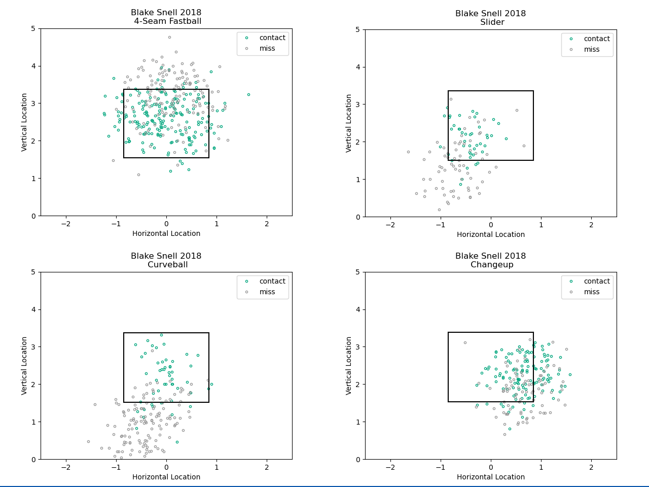
Source Code2018 American League Cy Young Winner - Blake Snell

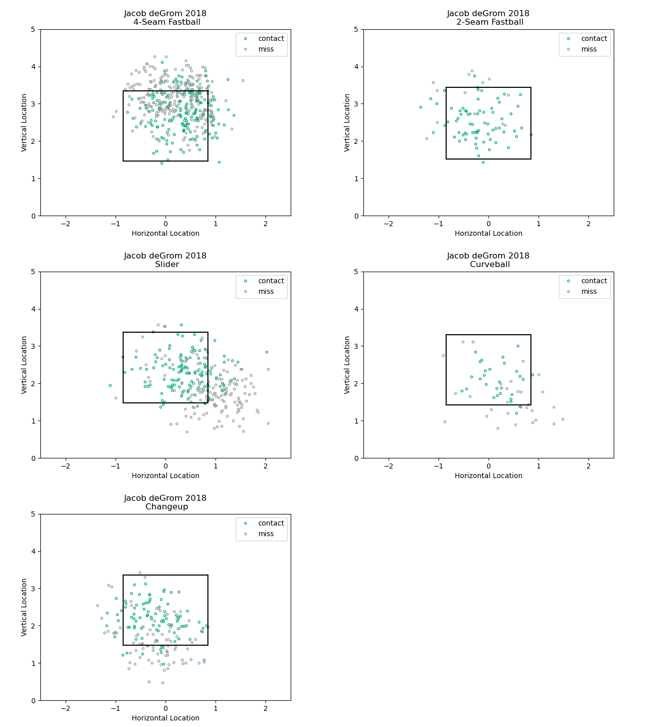
2018 National League Cy Young Winner - Jacob deGrom

The primary goal in this example of MLB Pitching Visualizer is to see which pitch type of a player has led to more swings and misses. A pitcher would want to make batter swing for their balls, especially when they're baiting batters out of the strike zone with breaking balls. Every pitcher will have own "winning strategy" and such tendency of using a certain strategy can be seen when it comes to visualization. For example, it can be seen that one of the Jacob deGrom in 2018's favorite pitch was a 4-Seam Fastball, aiming upper left corner of the strikezone. Like this, I believe this kind of data can serve better purposes through visualization, from analysis to simple visualization for baseball blog posts for users to understand.
I've collected the raw data through Baseballsavant's Statcast data. Statcast provides the location of strikezone for every pitch, pitch types, and corresponding results. While I've focused on swing and misses for this example, the one I'm working on right now is focusing on correlationship between ball speed and hits so that a researcher would be able to draw conclusion about whether there's a strong relationship between those factors. Those are just some of the potential combinations, and amazingly many sabermetrics can be supported one day. Although this example covers only 2 pitchers from 2018, technically this script, at current stage, can even analyze every pitcher in Statcast's raw csv files.